September 25, 2011
THE KITCHEN BEFORE + AFTER
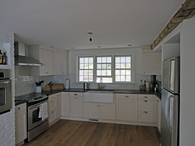
Our house was in really bad shape when we bought it. In addition to being vacant for at least the last 3 years (bats! mice! toads in the basement!) and it was also extremely quirky from both a structural standpoint (there isn't a level floor or ceiling to be found) and on the surface (think mint green walls with mustard-colored trim). Some solutions were easy to implement (white paint!) while others, such as lowering the floor, proved to be more costly and had longer trajectories. The recently completed kitchen renovation has been the biggest interior house project to date. Not surprisingly, this room had its own set of eccentricities, including a large brick chimney with an indoor grill and a half-bath with an interior window located in the pantry. The kitchen was also divided in the middle by a level change in both the flooring and the ceiling. Last Spring, after demo was complete and the walls were framed and sheet-rocked, contractors began working to install a new kitchen comprised of grey soapstone counter-tops, oak flooring, off-white cupboards, bright white subway tile, and a double porcelain farm sink. The indoor grill was re-purposed to contain the second oven and given a few coats of hi-gloss paint. A small mudroom was carved out near the door, and the windows were enlarged above the sink. Our architect friend PH had the genius idea of re-using the falling (now fallen) down barn window and wood in the new mudroom. At some point we'll get around to finding light fixtures, but right now we're just enjoying the luxury of having running water. See below for a series of before and after photographs.
Subscribe to:
Post Comments (Atom)


How could you not mention the spigot for filling pots?!?!?!?
ReplyDeletequite the transformation!! looks incredible! reusing the wood for the mudroom is a really cool idea and will look great!
ReplyDelete